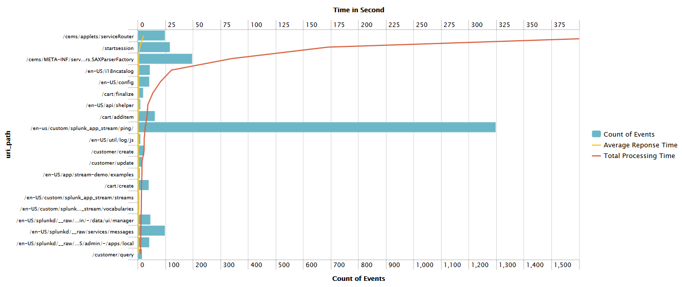
Server Side HTTP Response Time
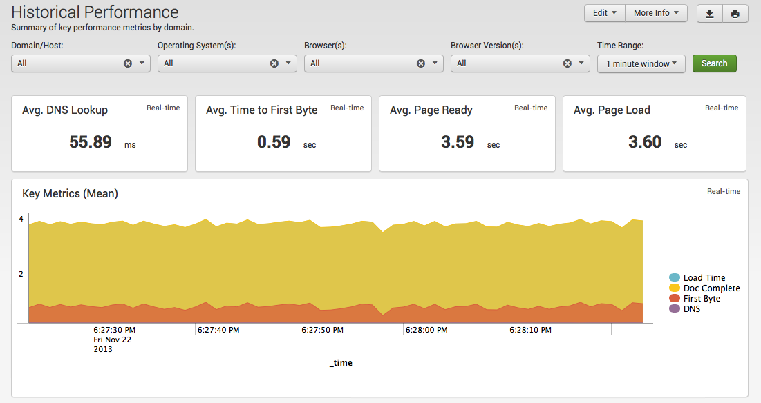
Client-Side Web Performance
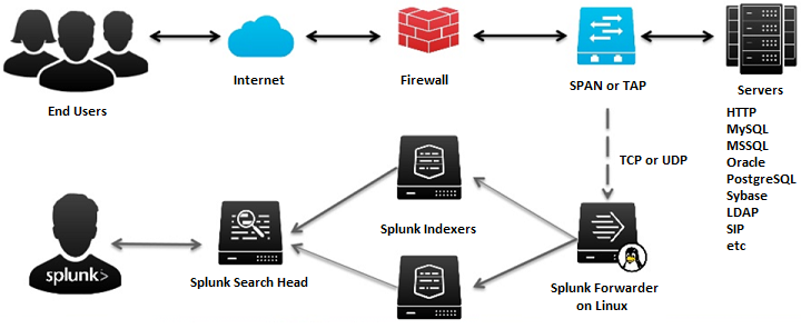
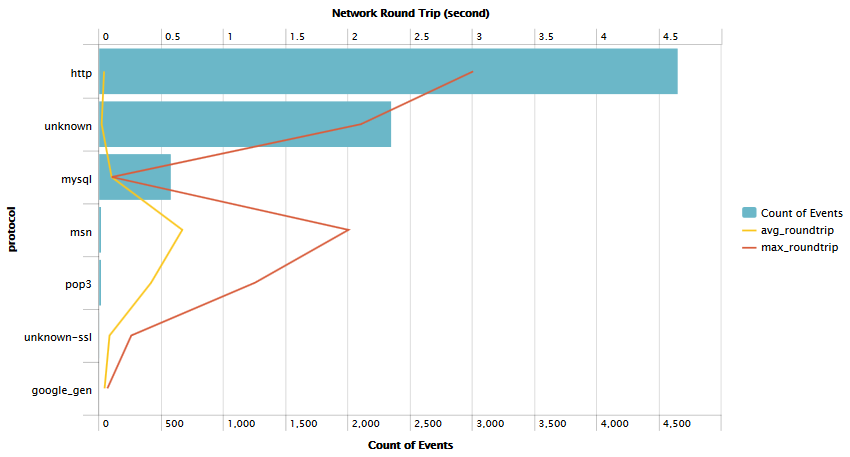
Network Round-Trip Time
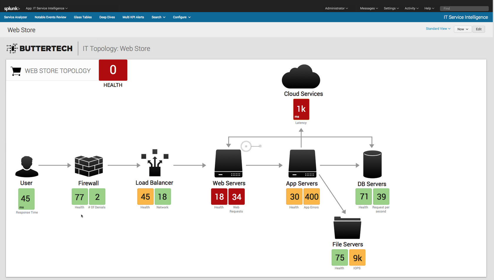
Glass Table (Runtime Application Architecture)
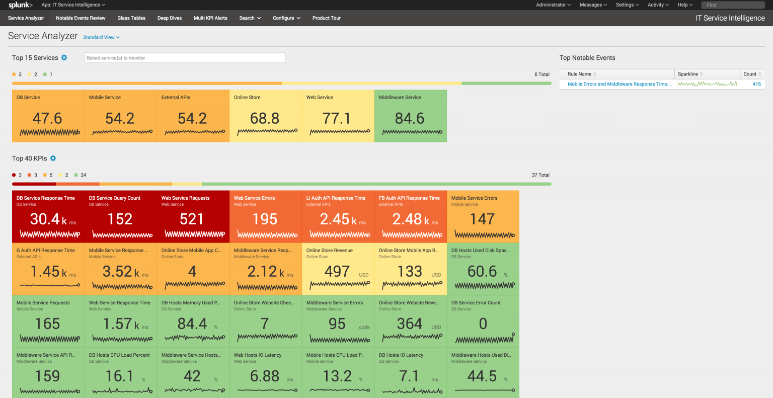
Service Analyzer
RAW Data Analytics
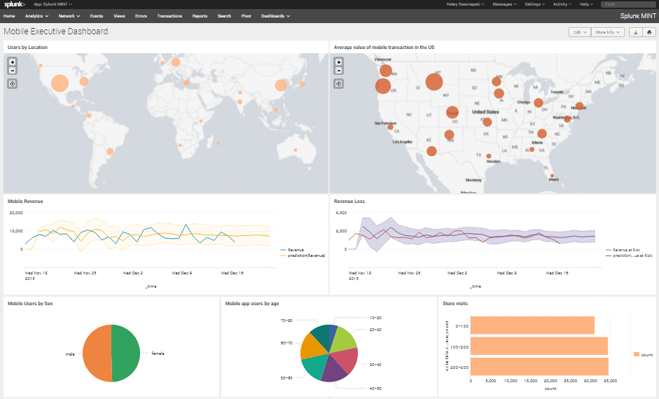
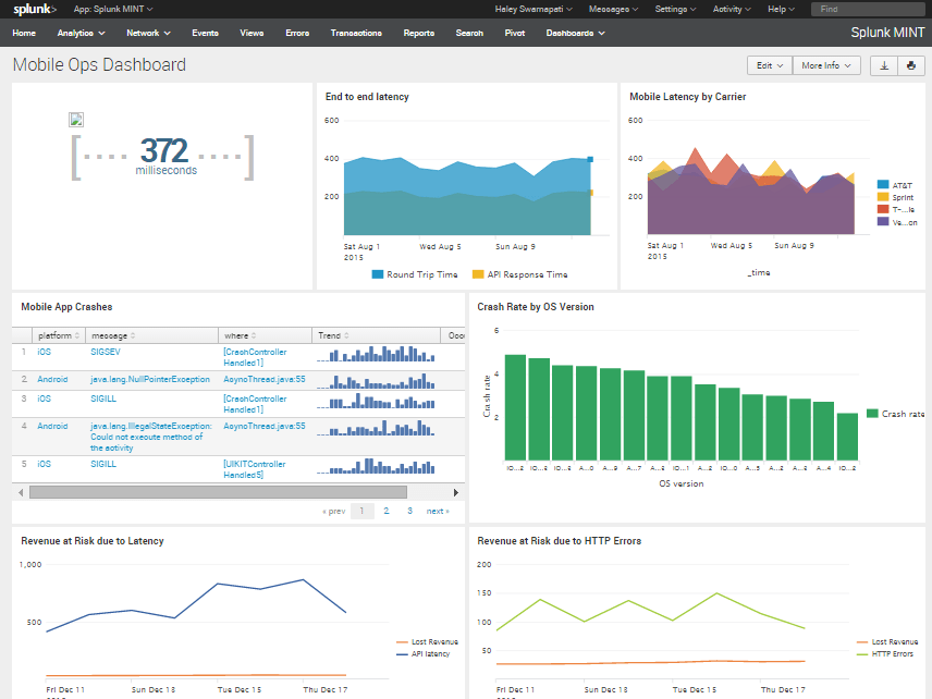
Mobile Ops Dashboard
Business Transactions
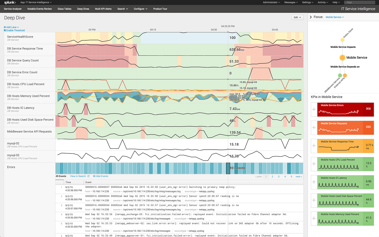
Errors (Deep Dive Component Monitoring)
Analytics and Reporting